Le Burger Week Visual Design by Loogart
Every year since 2012, between September 1-7, an army of restaurants across Canada and the U.S. will bring you the most incredible burgers you would have never imagined possible. This foodie initiative, which has become a flagship festival called “Le Burger Week” brings a whopping 200,000 + participants who increase traffic drastically at the restaurants who push culinary creativity to the next level.
Design partner
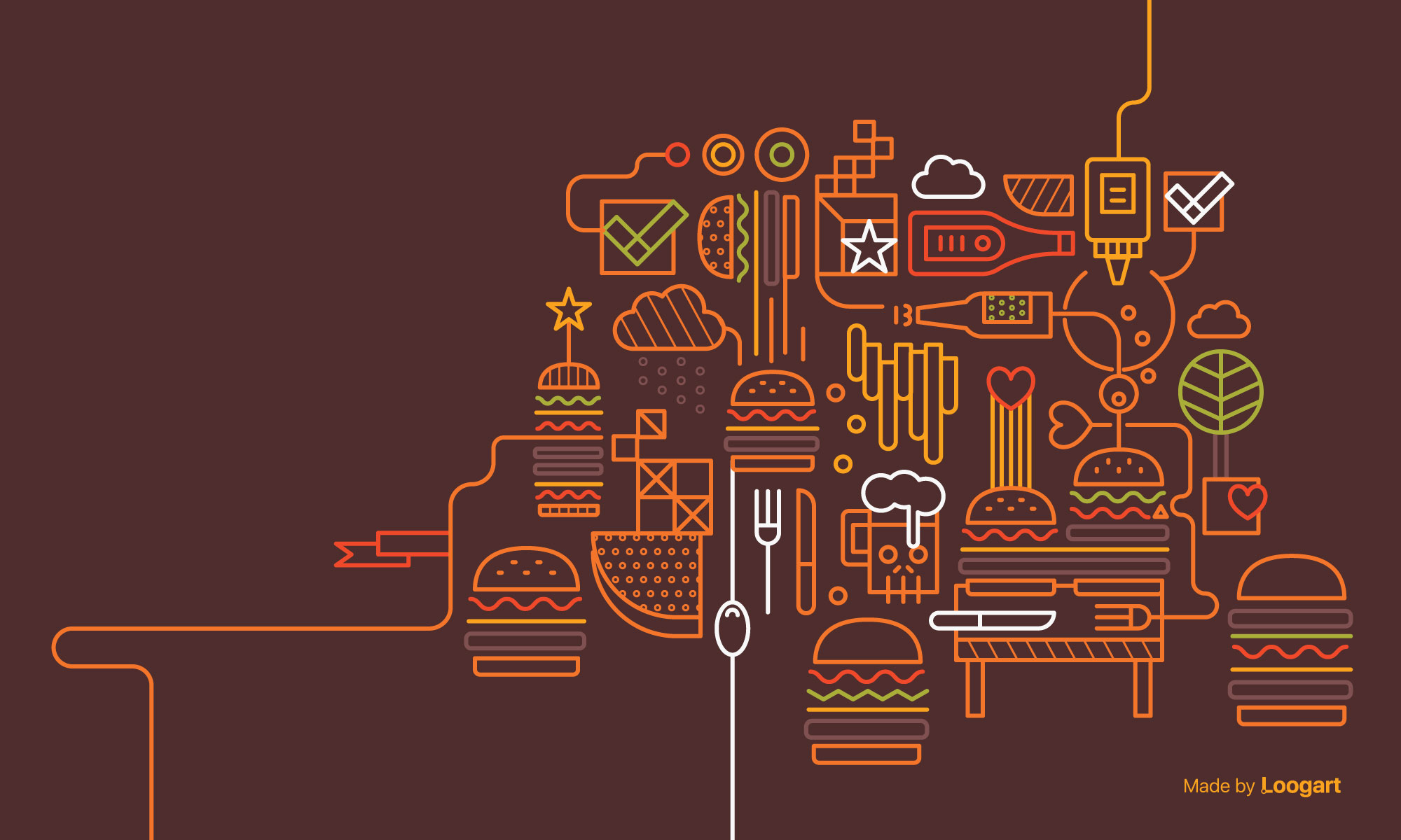
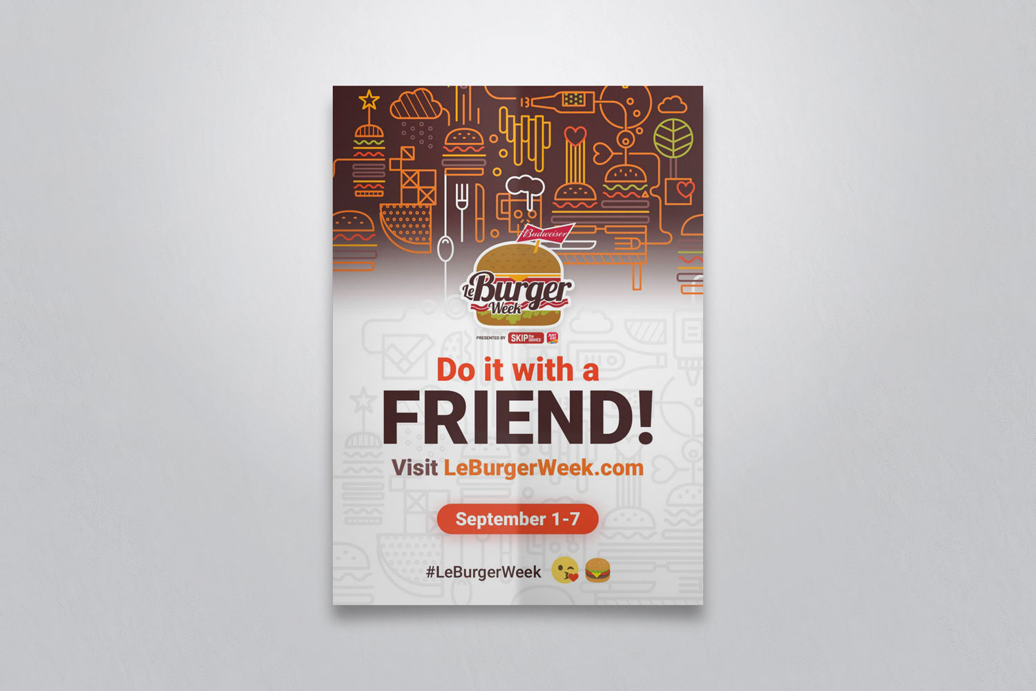
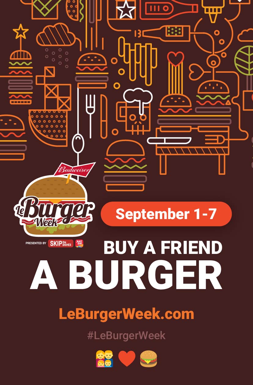
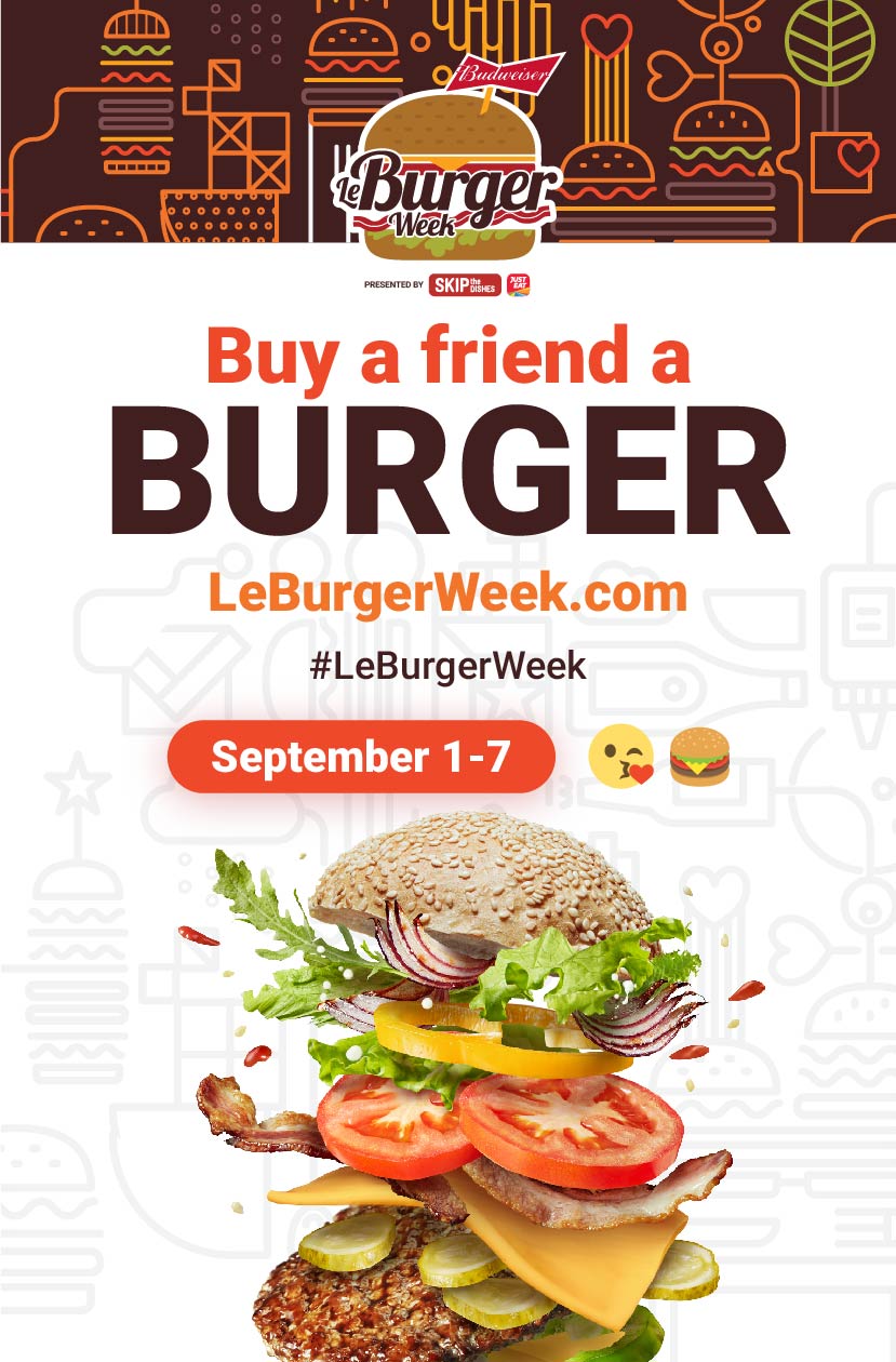
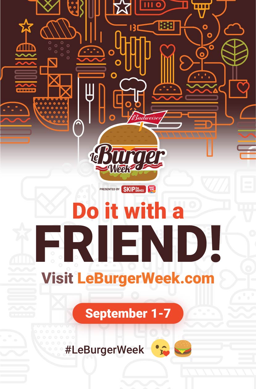
Loogart became a design partner of Le Burger Week and People Mover Tech. While maintaining the current logo design due to its popularity, we were challenged to create an accompanying visual design to solidify the brand and enhance its versatility on the web and on print material. This led to the creation of a custom line-art illustration based off the current brand which could be used as a primary or secondary element for any promotional material. E.g. it could be used as the main jumbotron on the website or a pattern background to accompany the logo on print material.

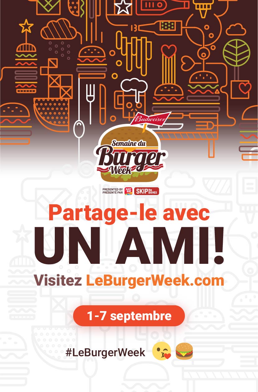
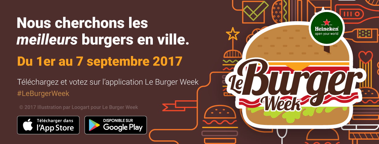
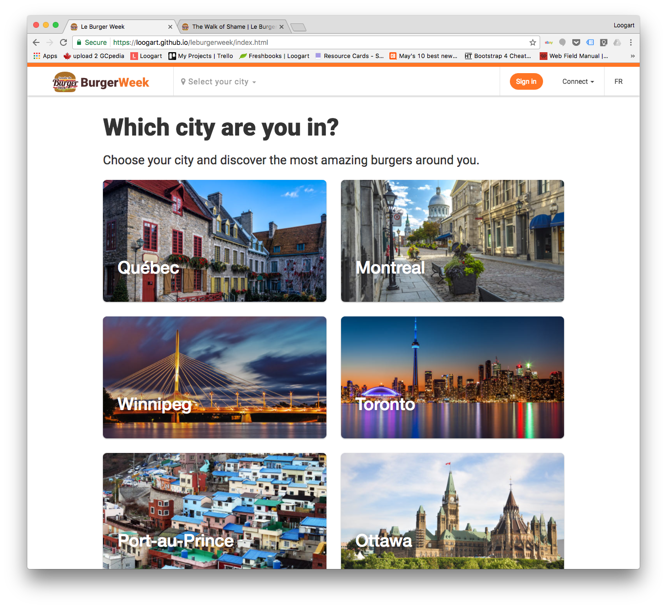
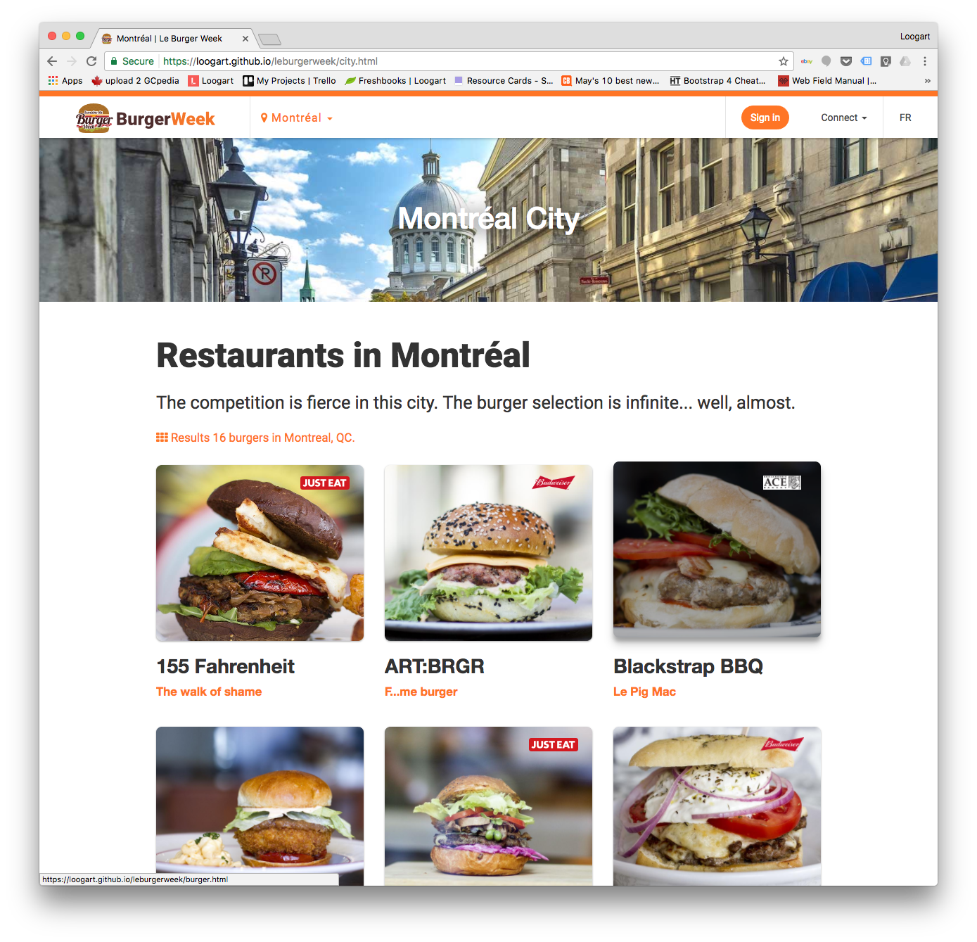
A brand new web experience
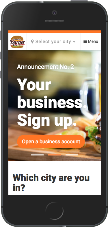
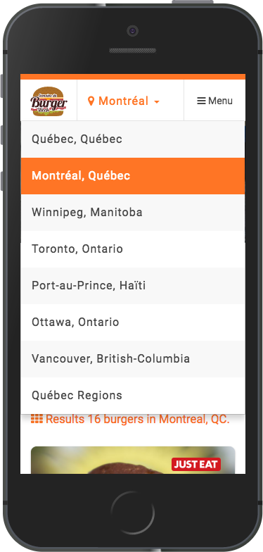
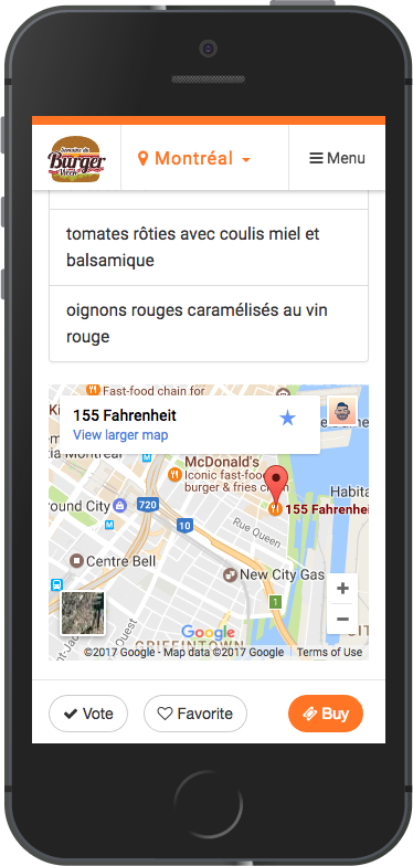
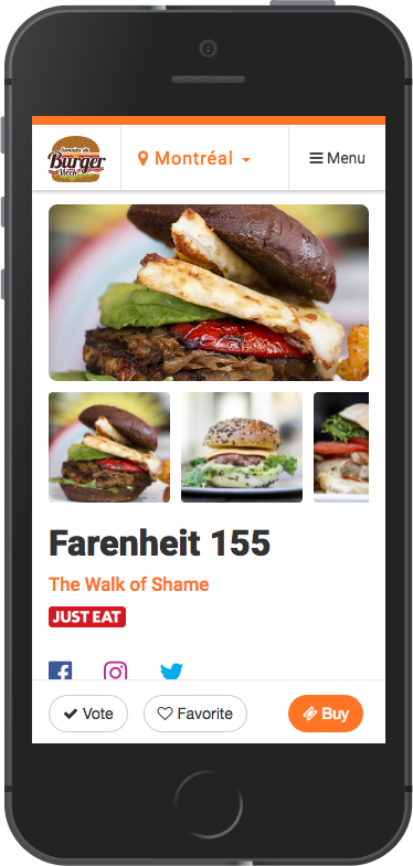
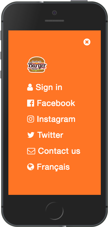
We redesigned the user experience and gave a new web interface to Le Burger Week based on user feedback from the previous years. Updates included a fresh and clean design with a familiar look, an improved mobile design, increased imagery, enhanced web typography, meaningful and delightful navigational animations.
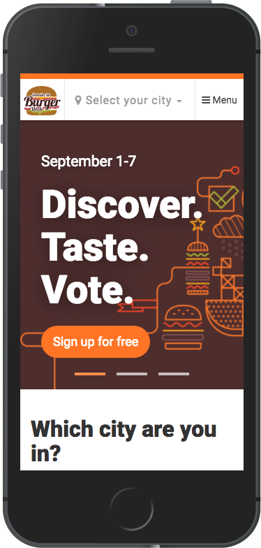
Web is King. Print is Queen.
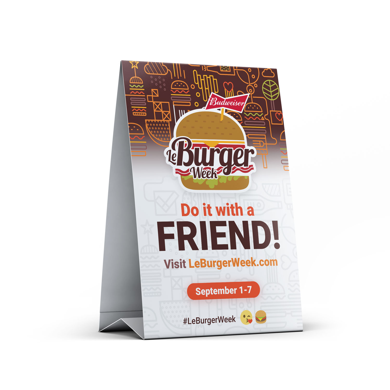
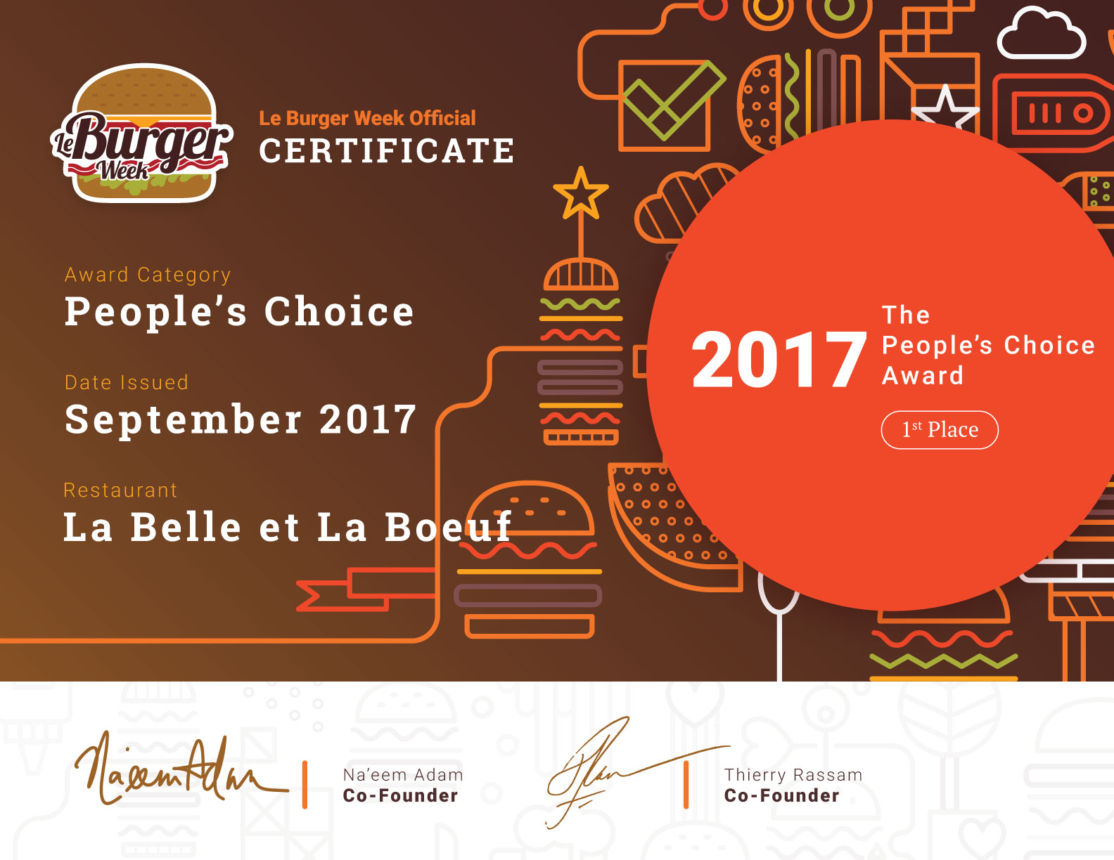
Loogart was also in charge of creating the graphic work for print material such as promotional posters, table tents, stickers and award certificates for award-winning restaurants.
